Tuesday, September 29, 2015
[P2]:4.5
I have been experimenting with placing my typeface on top of images to see how it affects the perception of the type. I am trying to explore advertising my typeface in a less expected direction.
Infographic Inspiration
These are some infographics that I find very inspiring for our infographic project. Many of these are heavily type based but there are a few excellent image focused ones as well.
[P2]:4
The Baskerville typeface was designed in 1754 by John Baskerville, a master type-founder and printer. The typeface is categorized as a transitional typeface. It is not quite a humanist, organic feeling typeface, but it is also not an entirely modern and high contrast typeface. When creating this typeface, John Baskerville looked at the mathematical and cold feeling typeface called Romain du Roi and decided to make a similar typeface with rounded bracket serifs and a vertical axis. The Baskerville typeface did not see much success during its creator's lifetime, however, it has since slowly gained popularity and respect for its elegant beauty and legibility.
Monday, September 28, 2015
[P2]:3
I have decided to use my "Rock Out" typeface for this project and have completed the character set for it. I have made many tweaks to the previous characters in an effort to get everything just right, but knowing me I will certainly find more things to "fix" over time.
My typeface is very sharp and angular. It feels mechanical, stiff, and unapproachable. These qualities make it seem somewhat brutal or sinister. The characters are also refined and clean cut however. They alight next to one another in an orderly fashion. This orderly quality combined with the jagged angles creates a rebellious tension. All of these qualities have led me to decide to represent my typeface within the context of rock music culture.
Jagged
Brutal
Rebellious
Classic Rock
Rock Concert
Wednesday, September 23, 2015
[P2]:2.5
I have narrowed my typeface choices to these two options.
I like to call this first one Rock Out. Keywords to describe this typeface would be sans-serif and blackletter. This is a display typeface not suitable for typing out significant amounts of text. It aims to maintain a somewhat medieval era feeling while also seeming modern due to its unadorned, refined, and angular edges. The bases of letters all either carry their strokes downward into points or flatten out without sending a descender down beneath the other characters. I have not yet decided if I will be making entire sets of both capital and lowercase letters. As of now all the letters are set as lowercase.
For the time being I am calling this typeface Run Through, although I'm not very fond of that name and I am likely to change it. If you happen to be wondering about why I chose that name in the first place, it is because I am trying to maintain a consistent band of negative space throughout the center of all my characters. This typeface is geometric and sans-serif. There are no humanist elements present as it does not resemble human handwriting at all. It feels cold, mechanical, and calculated. This is also a display typeface and should not be used for significant sections of text. At this time I plan on leaving this typeface with only capital characters.
Monday, September 21, 2015
[P2]:2
These are my initial typeface explorations, as well as some of my inspiration.
I am naturally attracted to more geometric, sharp, less humanistic typefaces. I have been greatly inspired by traditional German blackletter type. For one of my initial Fontstruct tests, I forced myself to attempt a more organic, humanist typeface, simply to make myself break out of my comfort zone. This forced me to learn the program more thoroughly.
Inspiration
Sketching
Initial Fontstruct Tests

Thursday, September 17, 2015
[P2]:1
Typeface History
The first Garamond typeface was made by the Parisian printer
Claude Garamond during the Renaissance in the first part of the sixteenth
century. Garamond died in 1561, after which his type punches were sent to
the printing office of Christoph Plantin in Antwerp. There the punches were used by Plantin for
many decades. They still exist in the
Plantin-Moretus museum today. However,
the history of the Garamond typeface is not so simple. Sixty years after Garamond’s death, the
French printer Jean Jannon issued a set of typefaces that shared very similar
characteristics to Garamond’s designs.
Jannon’s typefaces were lost for about two hundred years until they were
rediscovered by the French national printing office in 1825. The typefaces were wrongly attributed to
Claude Garamond until 1927. Many of the
modern revivals of the “Garamond” typefaces are based on the wrongly attributed
Jannon types. The Garamond typeface is a serif typeface that is very humanist,
meant to mimic natural handwriting. The
letterforms have a sense of fluidity and consistency.
Serifa is a typeface designed by Adrian Frutiger in 1966 for
the Bauer foundry. Its design is loosely
based on his earlier typeface, Univers, as well as older slab serif designs.
The design differs primarily with the addition of unbracketed serifs. This typeface can be categorized as an Egyptian
or slab serif font. This type of font is
typically difficult to read in blocks of text, however serifa contains enough
humanist elements to make it more easily legible as text. Serifa uses the same two number identification system that Frutiger designed for Univers.
Platelet was designed by Conor Mangat to resemble the
letters on a California license plate. The
restrictions for placing type on a license plate are similar to those of the
typewriter. The type must be monospaced not
only in order for the plate’s manufacture, but also to fulfil the need of
fitting a fixed number of characters onto each plate while maintaining
legibility at a distance. The platelet
font meets these challenges in its own way.
For example, the central lines of the “M” and “W” are shortened to make
the letters less dense. The letters “I”
and “L” fill their standard width by using a large curved lead-out, rather than
a more traditional large slab serif.
Monday, September 7, 2015
[P1]:4
Phase 2
"Phase 2" allowed our compositions yet again slightly more freedom. My favorite new freedom was the ability to use any 3 sizes of type.Designer Bios
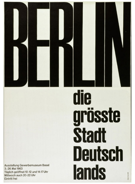
Joseph Müller Brockmann is one of the most prominent Swiss designers, and was a teacher at the Zurich school of arts and crafts by the age of 43 in . In 1958, he became the founding editor of the magazine New Graphic Design. He published two books on his personal work practices and philosophy.http://www.designishistory.com/1940/joseph-mueller-brockmann/
Emil Ruder was also a very prominent Swiss designer and typographer. He was a part of the faculty at Basel School of Design and his teaching involved both theory and philosophy, which sets his artwork apart. He also published the book Typographie: A Manual for Design, which became an important text used in programs in the US and Europe.
http://www.famousgraphicdesigners.org/emil-ruder
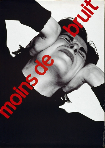
Robert Massin is a French designer who began working after World War II. He designed thousands of book covers and one of his most well known projects is Raymond Queneau's Exercises de style, in which the same story is told 99 different times but illustrated with a different design. He also founded the Association Typographies Expressives that promotes books that apply the theory of correspondences between sounds and colors.
http://www.designculture.it/interviews/robert-massin.html
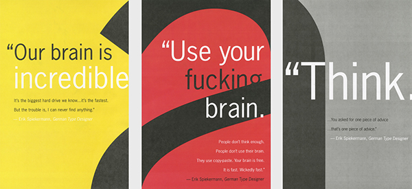
Erik Spiekermann is a German typographer that designed the passenger information for the Berlin Transit and campaigns for Audi, Volkswagen and Nokia. He's also the founder of FontShop, a mail-order distributor for digital fonts. He continues to work out of his letterpress design studio in Berlin and speak at conferences.
http://www.freundevonfreunden.com/interviews/erik-spiekermann/
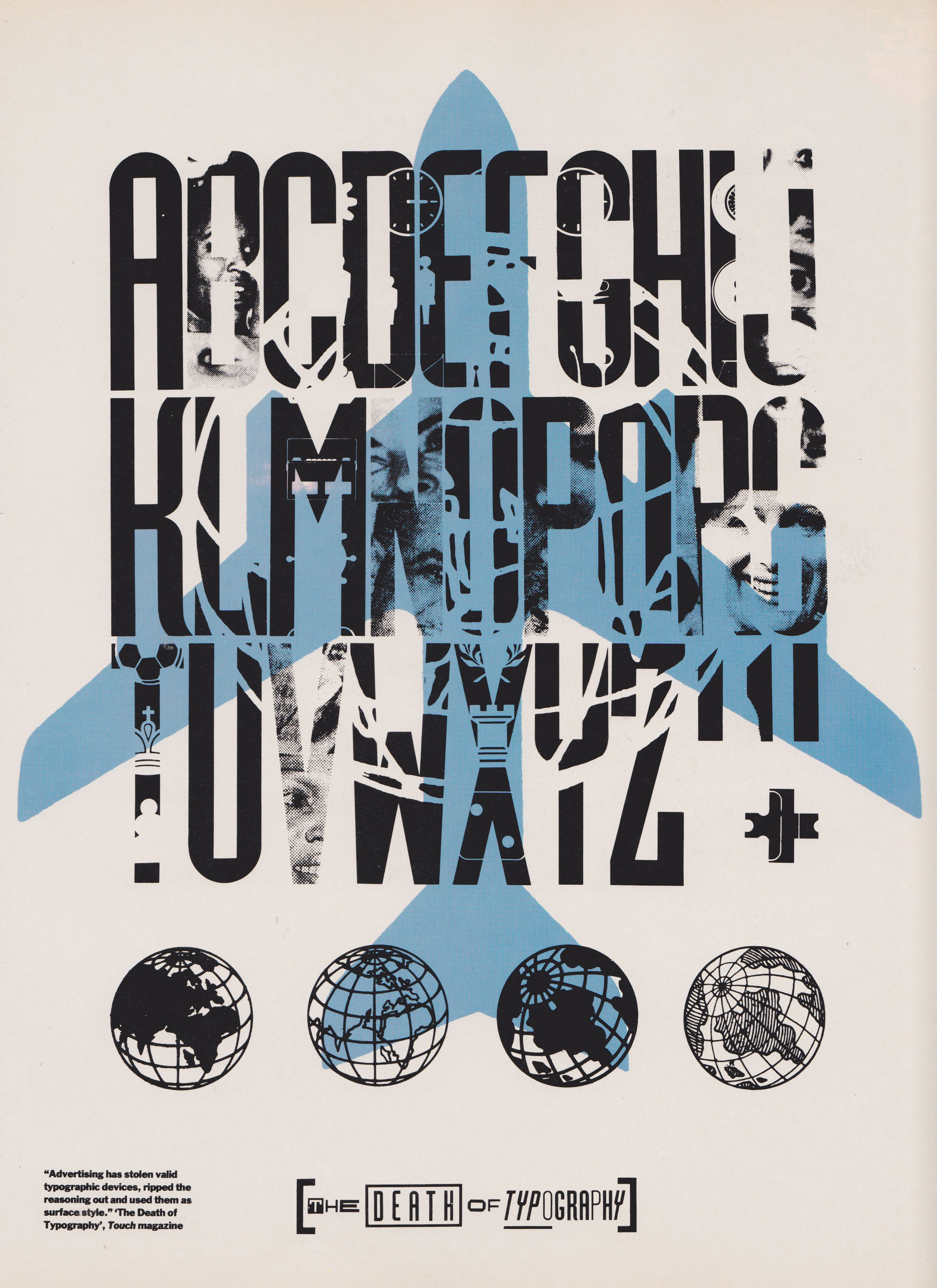
Neville Brody is a British designer who studied at the London College of Printing. He rose to prominence as an art director for The Face magazine. He is one of the founding members of Foundry, a London based type foundry, and has designed over 20 different typefaces over his career.
http://www.designishistory.com/1980/neville-brody/

Jessica Hische is an American letterer, illustrator, and graphic designer. She has been voted one of Forbes Magazine '30 under 30' in art and design. She worked for companies such as Penguin Books, Starbucks, and the New York Times.
http://theeverygirl.com/letterer-and-type-designer-jessica-hische
Subscribe to:
Comments (Atom)


